
How to use pophelper to create “smoother” ADMIXTURE plots
A couple of years ago, when I started out with bioinformatics, I had to create ADMIXTURE plots. After generating the ancestry fractions using ADMIXTURE, I used pophelper to create them. This is what my plot looked like (I recreated it using the 1000 Genomes Projects dataset):

And this is what I wanted my plot to look like:
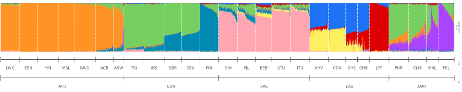
I wanted it to look smoother.
The problem I faced was that I could not reorder the population groups (e.g. LWK, ESN) using subsetgrp and sort individuals by their ancestry proportions using sortind="all" simultaneously. Here is the solution1.
Reading the files and creating population labels
I created a data frame called popnames where column 1 (V1) contains the population names listed for each sample in order, and column 2 (V2) contains the respective continental populations.
I set the stringsAsFactors as FALSE so that the population labels can be read by grplab.
In this example, I am using a K value of 8.
library(pophelper)

# population names
popnames <- read.table("pop.txt", stringsAsFactors = FALSE)

# K=8
alist8 <- readQ(files="ADMIX.8.Q")
Reordering the population groups
The next step was to reorder the populations using subsetgrp. However, instead of creating a plot, the data, which will contain the reordered population groups, will be saved to a variable.
grplab— assigns the population labelsselgrp = "V1"— because there are two population labels, I have to declare the one I’ll be using forordergrpandsubsetgrpordergrp = TRUE— in order to sort them usingsubsetgrp, I need to set this asTRUEso that all individuals from the same population are grouped togetherreturndata = TRUE— instead of plotting the data, the data will be stored as a variableexportplot = FALSE— does not create a plot
neworder <- plotQ(alist8, grplab=popnames[,c(1,2)],
                  selgrp = "V1",
                  ordergrp = TRUE,
                  subsetgrp = c("LWK", "ESN", "YRI", "MSL", "GWD", "ACB", "ASW", "TSI", "IBS", "GBR", "CEU", "FIN", "GIH", "PJL", "BEB", "STU", "ITU", "KHV", "CDX", "CHS", "CHB","JPT", "PUR", "CLM", "MXL", "PEL"),
                  returndata = TRUE,
                  exportplot = FALSE)
Creating an ADMIXTURE plot
Next, I created the plot. The data is located in neworder$data$qlist and the population labels are located in neworder$data$grplab[[1]].
sortind = "all"— all clusters (i.e. ancestry groups) are considered when sorting out the individualsexportpath=getwd()— export the plot in the current working directory
qdata2 <- plotQ(neworder$data$qlist, grplab=neworder$data$grplab[[1]],
                ordergrp = FALSE,
                selgrp = "V1",
                sortind = "all",
                height = 5,
                grplabheight = 1,
                showdiv = TRUE, divsize = 0.4,
                clustercol = c("#1D72F5","#DF0101","#77CE61", "#FF9326","#A945FF","#0089B2","#FDF060","#FFA6B2"),
                exportpath=getwd())
And voilà! A smoother, more satisfying plot.
Leave a comment